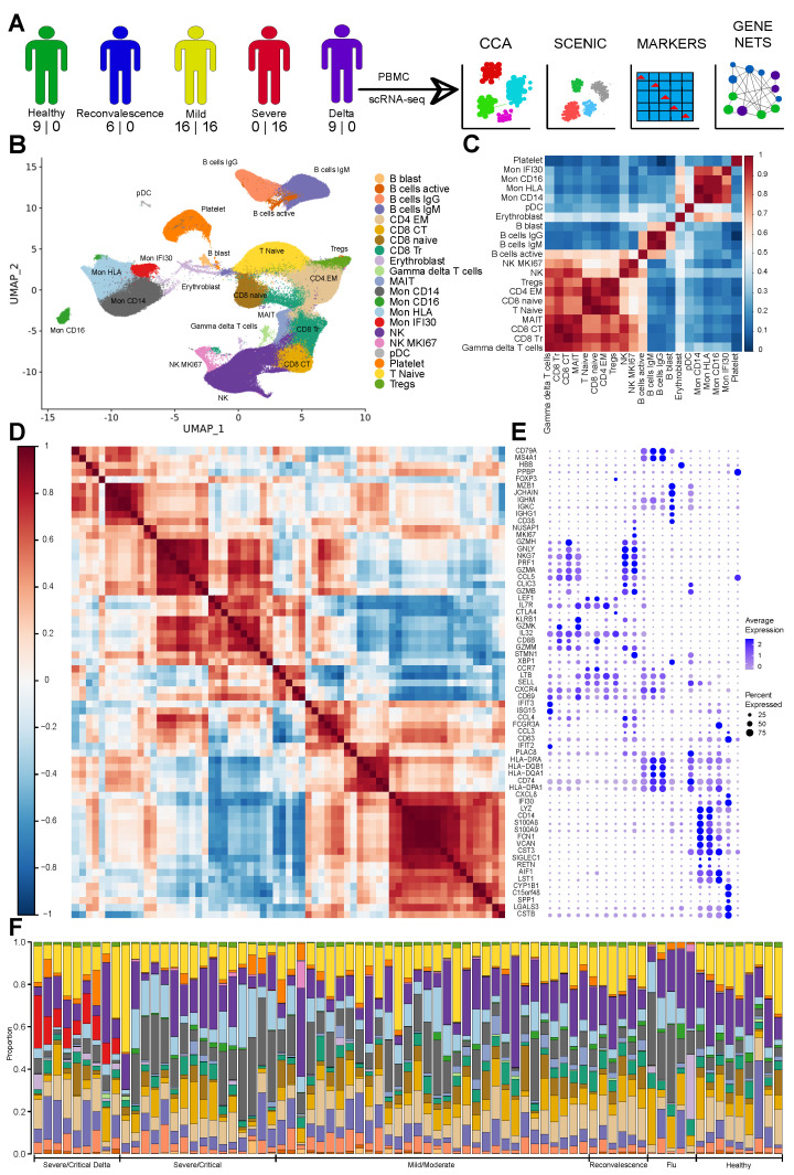
Figure 1.
(A) Schematic diagram showing assays performed on the PBMC of COVID-19 patients with numbers of newly sequenced and publicly available samples (shown as number in corresponding order). The diagram shows performed computational analysis regarding computational data integration made with Seurat CCA and SCENIC, identification of marker genes, and computational reconstruction of the Gene Regulatory Network. (B) UMAP with identified cell types. (C) Cell–cell correlation heatmap based on Pearson correlation of the average expression of highly variable genes depicting across cell types similarity. (D) Gene expression Pearson correlation heatmap indicating formed gene modules by marker genes. (E) Dot plot with the expression of marker genes for each cell type ordered according to the correlation on the (C), and gene ordered based on (D). Three plots (C–E) allow joint view highlighting similarity based on activity level of marker genes and cell type closeness as follows from the average expression correlation of highly variable genes. (F) Stacked bar plot with cell type fractions for each sample colored according to the pallet of UMAP. We identified clearly visible Mon IFI30 cells fraction in the samples with Delta variant.

