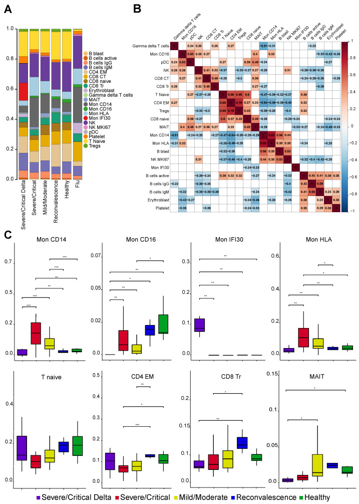
Figure 2.
(A) Stacked bar plot with the average fraction of cell subtypes across samples. (B) Pearson correlation heatmap of the cell fraction for each subtype across samples. Statistically not significant (p-value > 0.05 according to cor.test in R) elements are blank. (C) Boxplot with the fraction of cell subtypes in each sample. *, **, *** means significant changes calculated with Wilcoxon rank-sum and shown as bar.

