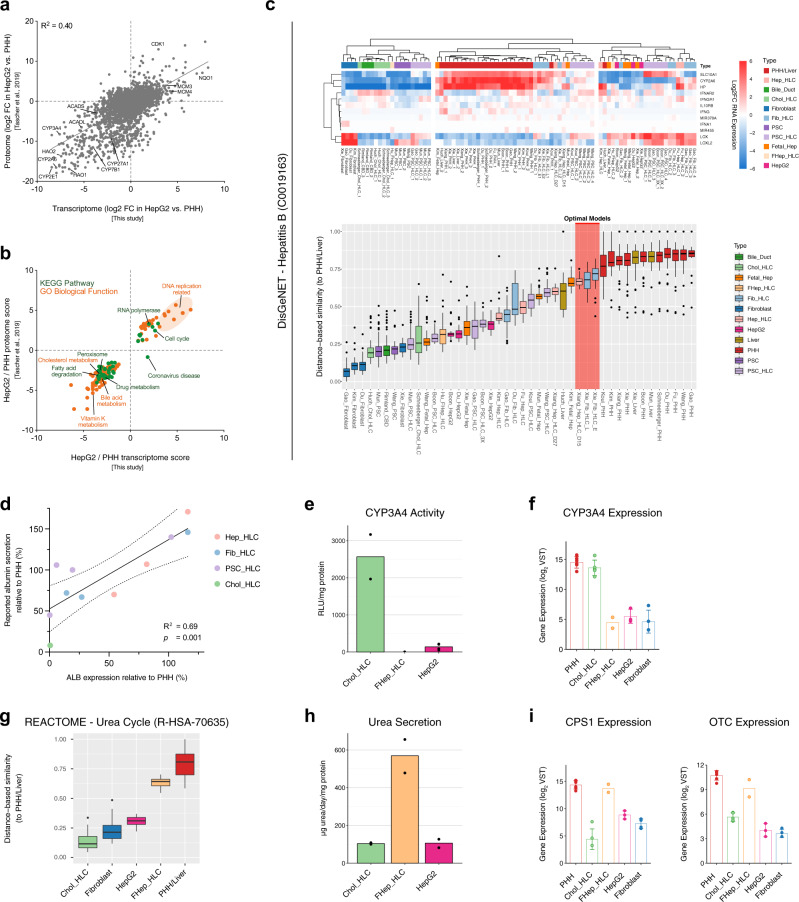
Fig. 4. Transcriptomic comparison allows prediction of HLC functionality.
a Scatter plot of protein abundance ratios against corresponding mRNA ratios in HepG2 cells vs. PHHs for proteins/genes that are detected in both transcriptome (from our transcriptomic comparison) and proteome (from Tascher et al.68). Pearson’s coefficient of determination (R2) is shown at the top left of the plot. b Scatter plot of enriched pathways based on transcriptome and proteome. Only pathways that are enriched on both the transcriptomic and proteomic levels are shown. c Heatmap and DBS of hepatitis B associated genes according to the DisGeNET database. Red highlight indicates the predicted optimal hepatocyte in vitro models. d Correlation plot of the gene expression levels of ALB from the transcriptomic comparison data (x-axis) and the reported relative albumin secretion (y-axis) in included HLCs. Pearson’s coefficient of determination (R2) and P value (p) are shown on the bottom right of the graph (n = 11 biologically independent samples). Dotted lines represent the 95% confidence interval. e CYP3A4 activities presented as mean. f Gene expression level of CYP3A4 from the transcriptomic comparison data presented as mean ± standard deviation. g The DBS of urea cycle genes according to the Reactome database. The combined values of Chol-HLC, fibroblast, HepG2 cell, FHep-HLC, and PHH/liver samples from different studies are presented. h Urea secretion level presented as mean. i Gene expression level of CPS1 and OTC from the transcriptomic comparison data presented as mean ± standard deviation. Box-and-whisker plots are shown as median (line), interquartile range (box), and data range or 1.5x interquartile range (whisker). Source data are provided in Supplementary Data 7.

