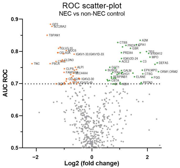
Figure 3.
ROC scatterplot summarizing differentially abundant proteins in NEC stools. “Volcano-type” ROC scatter-plot of 489 proteins with ≥38 quantified values. On the plot, the x-axis represents the log2 fold change ratio of the mean protein levels of NEC vs. non-NEC control samples, the y-axis is the area under the curve (AUC) of the receiver operating characteristic (ROC) curve and the orange and green dots show down- and up-regulated protein levels passing the 0.7 AUC threshold (dashed line), respectively. For more clarity, gene symbols are used on the plot (see Supplementary Table S1 for corresponding protein name). Some labels have been skipped.

