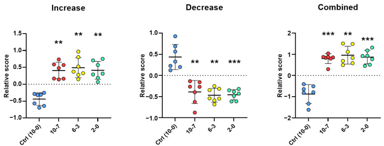
Figure 9.
Relative score by period. The plots show the relative scores (Y-axis) for each of the seven NEC samples (red, yellow and green dots) of the three tested periods (X-axis: 10-7, 6-3, 2-0 days before NEC diagnosis) compared to the average of the three same periods for the non-NEC control samples (Ctrl: 10-0 days; blue dots) to assess the overall relative scores for samples from NEC and non-NEC infants without pairing. The (Increase) and (Decrease) plots were calculated from the 18 increased and the 18 decreased protein markers taken separately, and the (Combined) plot combines the mean values of these two plots for each sample (increased + decreased; multiply by −1). The means ±SD are shown on the plots by horizontal bars. p-values were calculated using one-way ANOVA Dunnett’s multiple comparisons test. ** p < 0.01; *** p < 0.001.

