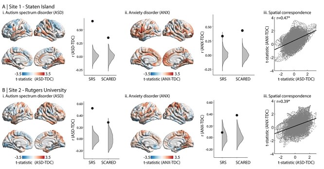
Figure 2.
Case–control analysis. Cortical thickness comparison of TDC with (i) ASD and (ii) ANX. The neighboring plots show the correlation coefficient of the correspondence between each group difference map with each phenotypic map (from Fig. 1). The large black dots indicate the empirical correlation coefficient, while the gray areas represent the null distribution. Thereby, when the black dot is higher than the gray area, the correlation is significant. (iii) Scatter plots show spatial map correspondence between ASD-vs-TDC and ANX-vs-TDC.

