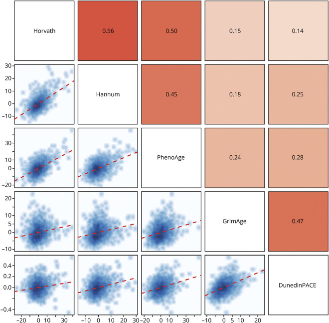
Figure 1. Correlations Between the 5 DNA Methylation Measures of Aging in ADNI.
The matrix above the diagonal plots the Pearson r statistic (with cell color depicting magnitude from light = low to dark = high), while the matrix below the diagonal shows the scatterplots for each comparison. The red dotted line describes the linear regression line. Correlations are adjusted for sex.

