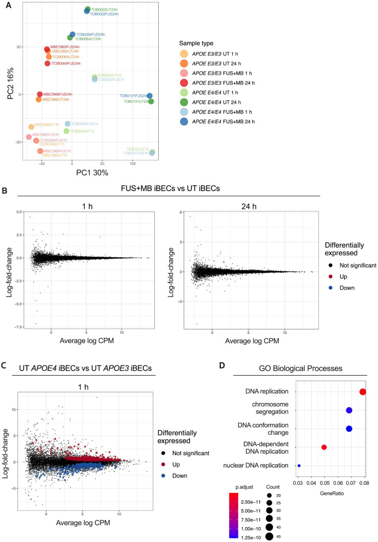
Figure 2.
Transcriptome analysis of the response to FUS+MB in APOE3 and APOE4 iBECs. (A) Principal component analysis (PCA) of gene expression profiles for all iBEC samples. The percentage of variance explained by principal component 1 (PC1) and principal component 2 (PC2) shown in axis labels. (B) Mean-difference (MD) plots showing log-fold-change vs average log expression values (log2 counts per million, CPM). Left panel: FUS+MB treated APOE3 and APOE4 iBECs at 1 h vs UT APOE3 and APOE4 iBECs at 1 h. Right panel: FUS+MB treated APOE3 and APOE4 iBECs at 24 h vs UT APOE3 and APOE4 iBECs at 24 h. (C) MD plot showing log-fold-change and average log expression values in UT APOE4 iBECs at 1 h versus APOE3 iBECs at 1 h. N = 3 biological replicates. (D) Dot plot of top 5 gene ontology (GO) terms from sub ontology Biological Process enriched from comparison of UT APOE4 iBECs at 1h vs UT APOE3 iBECs at 1 h. The dot size represents the number of genes associated with the GO term and the dot color represents the FDR value. The differentially expressed genes (i.e. FDR < 0.05) from this comparison were used as input to the analysis.

