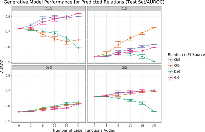
Fig. 2.
Edge-specific label functions perform better than edge-mismatch label functions, but certain mismatch situations show signs of successful transfer. Each line plot header depicts the edge type the generative model is trying to predict, while the colors represent the source of label functions. For example, orange represents sampling label functions designed to predict the Compound-treats-Disease (CtD) edge type. The x-axis shows the number of randomly sampled label functions incorporated as an addition to the database-only baseline model (the point at 0). The y-axis shows the area under the receiver operating curve (AUROC). Each point on the plot shows the average of 50 sample runs, while the error bars show the 95% confidence intervals of all runs. The baseline and “All” data points consist of sampling from the entire fixed set of label functions

