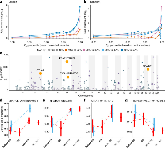
Fig. 2. Positive selection at immune loci.
a,b, Enrichment of highly differentiated sites in functional regions relative to neutral regions when comparing the pre-Black Death (BD) population to the post-BD population in London (a) and Denmark (b). c, FST between London before and after the Black Death, limited to the 535 sites that show qualitative patterns consistent with natural selection (namely allele frequency changes in the same direction in both London and Denmark after the Black Death, and the opposite direction for individuals who died during the Black Death (Supplementary Table 4)). Manhattan plot showing loci with patterns indicative of positive selection. Point size and colour intensity (which alternates by chromosome) represents the –log10 P value comparing populations in London before and after the plague, points coloured in orange represent the four positions and their associated genes, which are highly differentiated in Denmark as well. d–g, Patterns of allelic change over time for the four strongest candidates for positive selection. Error bars represent the standard deviation based on bootstrapping individuals from that population and each time point 10,000 times. Allele frequencies for London are shown in red and for Denmark are shown in blue. Modern allele frequencies are derived from 1000 Genomes data for Great Britain in London51.

