FIGURE 3.
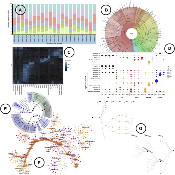
An overview of the visual encodings used to display (relative) abundance and hierarchical/relational structures; (A) relative abundance displayed by means of a stacked bar chart in BURRITO (McNally et al., 2018), (B) a krona sunburst chart showing the taxonomic hierarchy of the observed bacteria and their relative abundance (Ondov et al., 2011), (C) OTU abundance visualized as a heatmap using Phyloseq (McMurdie and Holmes, 2013), (D) relative abundance of OTUs represented in a bubble plot (Dussud et al., 2018), (E) GraPhlAn, a tree based visualization tool that allows to add visual annotations (Asnicar et al., 2015), (F) a “heat tree” visualization showing the taxonomic hierarchy within its tree structure and OTU abundance using node width (Foster et al., 2017), (G) taxa and function hierarchy displayed within tree structures in BURRITO with node width representing abundance (McNally et al., 2018).

