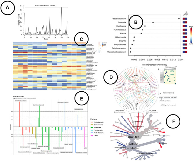
FIGURE 5.
An overview of the visual encodings used to display differential abundant taxa and identified biomarkers; (A) Manhattan plot showing statistically significant differential abundant taxa (Harris et al., 2015), (B) a visual presentation of the most significant taxa (potential biomarkers) (Cosma-Grigorov et al., 2020), (C) difference in abundance of significant taxa shown in a heatmap in BiomMiner (Shamsaddini et al., 2020), (D) “community shuffling plot” showing the changes in microbial interactions between clinical groups in Netshift (Kuntal et al., 2019a), (E) rocky mountain plot indicating differential abundant taxa in tidyMicro (Carpenter et al., 2021), (F) a heat tree visualization showing significantly different taxa between disease and control group (Cosma-Grigorov et al., 2020).

