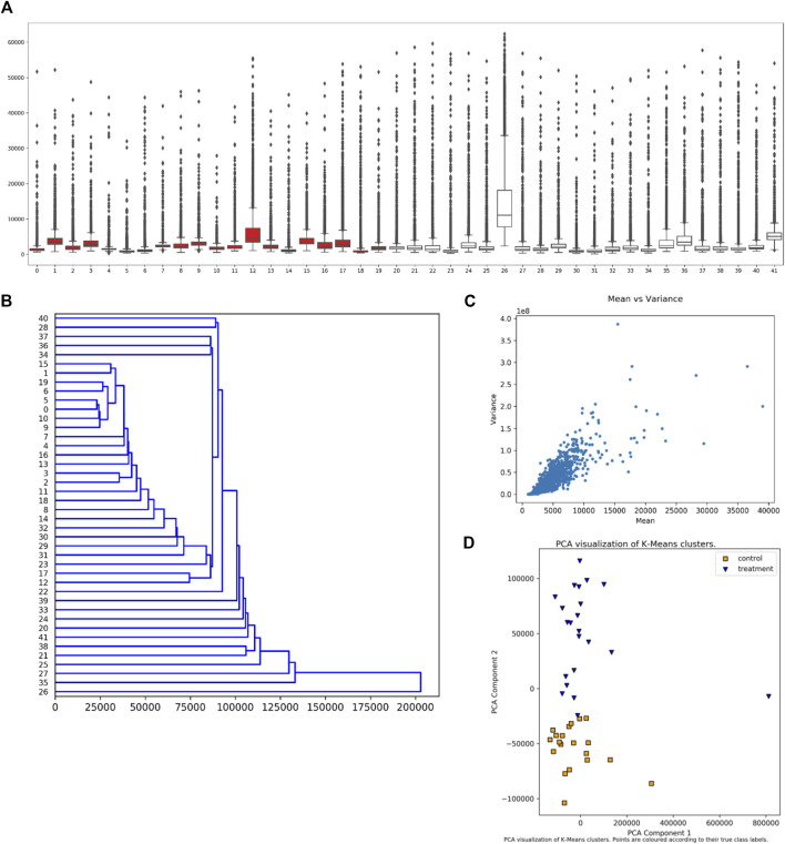
FIGURE 3.
Synoptic Visualizations Available in EPIphany. EPIphany provides a number of visualizations that are available after its initial analysis. These include: (A) boxplots or box-and-whisker plots, which show the distribution of all peptide values for each sample (dataset); (B) dendrograms, which show hierarchical clustering of samples (input datasets) based on response intensity across a subset of peptides; (C) mean vs. variance plots, through which a user can check for heteroscedasticity; and (D) PCA (principal component analysis) plots of k-means clustering of control and treatment samples. The samples under consideration label the x-axis in the boxplot (A) and y-axis in the dendrogram (B). Intensity is shown on the y-axis in the boxplot (A) and x-axis in the mean-variance plot (C). In the boxplot (A), the rectangle indicates the extent of the first and third quartiles, with the line crossing the rectangle indicating the median. Lines extending beyond the rectangle (“whiskers”) indicate observations prior to the first quartile and after the third quartile. Dots beyond the whiskers indicate outliers. For the k-means clustering (D), k is set to 2 reflecting the situation that the samples come from two cohorts, treatment and control. The clustering is performed prior to the PCA.

