FIGURE 4.
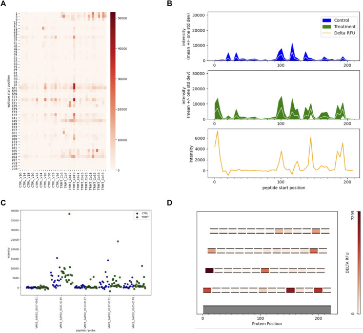
Targeted Analyses and Visualizations Available in EPIphany. EPIphany offers follow-on data visualizations by allowing user-defined tables to be uploaded and choice among the four representative plots. The uploaded tables specify the peptides to be selected for visualization, as well as the pathogen, protein, and peptide position (within that protein) of each peptide. (A) Heat maps allow for the visualization of each individual sample reactivity. Peptides listed on the y-axis are arranged N-terminus to C-terminus. (B) Line graphs generate an immunosignature by displaying the mean intensity ± 1SD for the control and treatment cohorts, with an additional panel displaying effect size (“delta RFU” or the difference in mean signal intensity between the two cohorts). (C) Strip plots show the distribution of spot intensities with more precision than the other types of plots. (D) In scenarios where overlapping peptides are used to identify and locate antigenic regions within a polypeptide or protein, epitope maps show the location of individual peptides on an index sequence with effect size of the peptides colour-coded. Epitope maps provide a simple yet effective means to identify the core regions of antibody reactivity.

