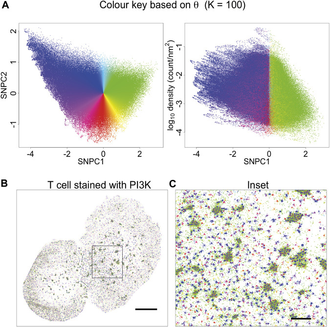
FIGURE 4.
Visualisation based on theta for K = 100. (A) A novel visualisation is constructed by converting θ to hue. (B) PAINT image of T cell stained with PI3K probe, and coloured according to (A). This choice of visualisation highlights cluster size (or local aggregation within microclusters) and contrasts aggregation (blue, violet, magenta, red, orange) with segregation (green). (C) Inset of (B). This visualisation is limited in that it is only based on a single parameter. Other information is suppressed, for example, segregated points (green) have a different density within or outside microclusters. This indicates that they arise from different processes: they occur in-between tightly packed molecules within microclusters, and as spurious noise outside the microclusters.

