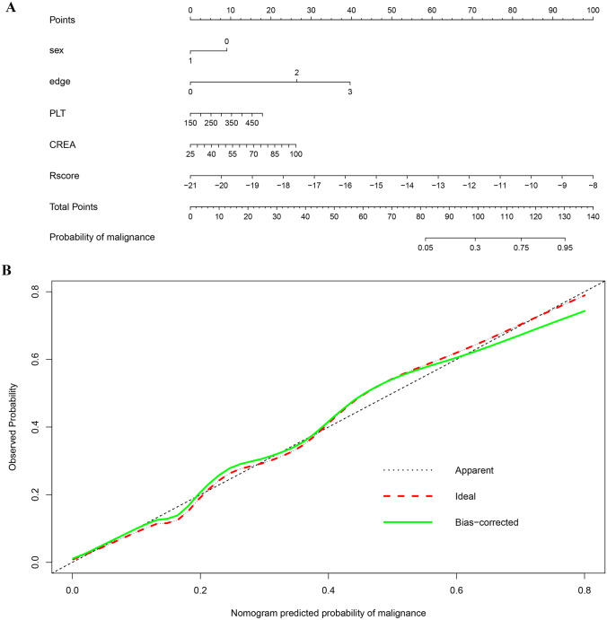
Fig. 5.
a Nomogram developed based on the combined model; b calibration curve of the combined model. The “Ideal” line represents the perfect prediction as the predicted probabilities equal to the observed probabilities. The “Apparent” curve is the calibration of the entire cohort. The “Bias-correct” curve was the calibration created by internal validation of 1000-replicate bootstrap on the entire cohort

