
Fig. 3 –
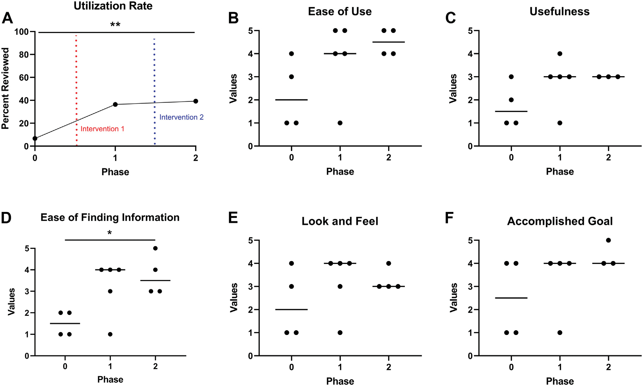
Graphs detailing PROM dashboard utilization rates by colorectal surgeons (A) and their attitudes toward the PROM dashboard (B-F). A value of five represents the most positive attitude in a particular domain, while a value of one represents the most negative attitude in a particular domain. A value of three represents a neutral attitude. Graphs B-F display surgeon attitudes about the PROM dashboard’s ease of use (B), usefulness (C), ease of finding information (D), and look and feel (E) from baseline to phase 2. Finally, the perceived ability of colorectal surgeons to accomplish their goal after navigating to the PROM dashboard is shown (F). Horizontal bars in graphs B-F represent the median. *P < 0.05. **P < 0.01.