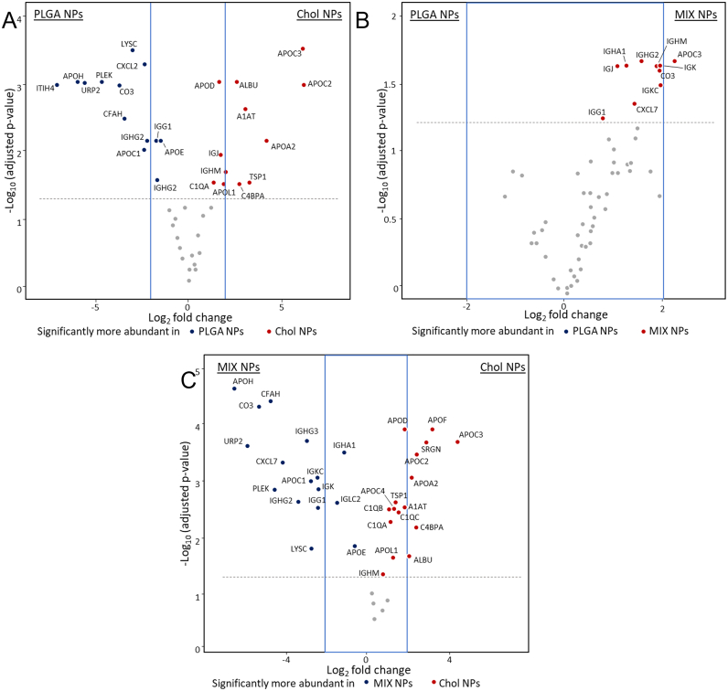
Fig. 4.
Volcano plots representing relative abundance of the proteins detected in the HC comparing NPs of different matrices. A) PLGA vs MIX NPs. B) PLGA vs Chol NPs. C) MIX vs Chol NPs. The dotted line represents the limit of statistical significance; the blue square represents a secondary selection for those proteins that are at least 2-fold more present in one sample than its counterpart. The complete statistical analysis is reported in Fig. S3. (For interpretation of the references to colour in this figure legend, the reader is referred to the web version of this article.)

