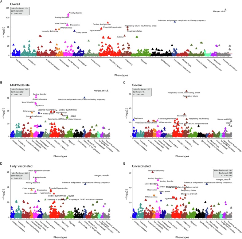
Fig. 2.
Random 1:4 CCWR 90-day analysis Manhattan plots. Panel of PheWAS Manhattan plots showing overall (panel A) and stratified by COVID-19 severity (panels B and C) and vaccination status (panels D and E). PheCodes (grouped by category) are on the x-axis and the -log10(p-value) is on the y-axis. The Bonferroni-adjusted p-value threshold line (in red) is shown, and the nominal p-value threshold (0.05) is also shown in blue. For each panel, the number of hits at the Bonferroni, Holm-Bonferroni and nominal p-value threshold are provided. Some of the top hits for each plot are annotated. For each hit, an upward pointing triangle represents a positive association (OR greater than 1), and a downward facing triangle represents a negative association (OR < 1). Note: The following two PheCodes were removed from plots for better visualization due to their extreme p-values: “Other infectious and parasitic diseases” (p = 1.2e-119 in overall cohort) and “Other headache syndromes” (p = 1.9e-139 in overall cohort). The former is a PheCode connected to COVID-19 infection and sequelae, [47] so its low p-value is unsurprising. The extreme association seen for “Other headache syndromes” is somewhat more surprising because it had a negative association with the “post-COVID-19 period”, perhaps relating to patients being less willing to visit the doctor for a “mild” symptom like headache during a pandemic. (For interpretation of the references to colour in this figure legend, the reader is referred to the web version of this article.)

