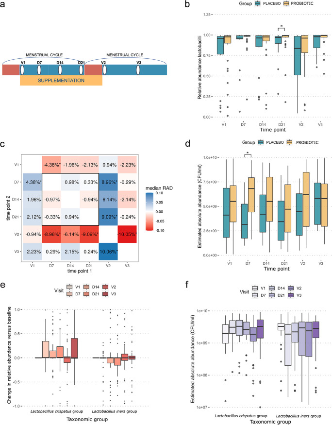
FIG 3.
Abundances of lactobacilli over the course of the study. (a) Schematic showing a simplified timeline of the study. Red bars indicate menstruation, the yellow bar indicates supplementation with the study medication/placebo, and white ovals indicate a sampling time point. (b) Box plot showing tje relative abundances of the Lactobacillus genus for the placebo group (blue) (left) and the two probiotic groups combined (treatment) (yellow) (right). (c) The relative abundances of lactobacilli were compared for all combinations of time points. Each cell compares two time points and contains the median relative abundance difference (RAD) between the time points. A positive value indicates that the participants had higher Lactobacillus abundances at time point 2 (y axis) than at time point 1 (x axis). (d) Box plot of estimated absolute abundances of the Lactobacillus genus for the placebo group (blue) (left) and the two probiotic groups combined (treatment) (yellow) (right). (e) Box plot showing changes in the relative abundances of L. crispatus group ASVs (left) and L. iners group ASVs (right), combined for the placebo and probiotic groups. This was calculated by subtracting the relative abundance of the specific taxon in the V1 sample from the same participant from the relative abundance of the sample. (f) Box plot indicating the estimated absolute abundances of L. crispatus (left) and L. iners (right) in the samples. The red (e) and purple (f) shades indicate the time points at which the samples were collected. *P < 0.05.

