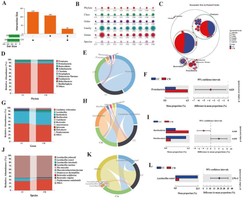
Figure 5.
Analysis of the dominant bacteria of the gut contents in the mice. (A) Upset diagram. It presents the number of shared OTUs as well as the number of unique OTUs for the two groups. (B) Multiaxial bubble diagram. The composition of each sample in the two groups varied at six taxonomic levels. (C) Classification hierarchy tree diagram. Different colored circles represent different taxonomic levels. The larger the area of the sector in the circle, the higher the abundance of that taxonomic unit in the corresponding grouping. (D) Horizontal bar diagram of the phylum level. The top 10 dominant phyla in terms of the relative abundance. (E) Chord chart of the phylum level. The dominant phyla in the top 10 relative abundance rankings and greater than 1%. (F) Dominant phyla with a significant variation. (G) Horizontal bar diagram of the genus level. The top 10 dominant genera in terms of the relative abundance. (H) Chord chart of the genus level. The dominant genera in the top 10 relative abundance rankings and greater than 1%. (I) Dominant genus with significant variation. (J) Horizontal bar diagram of the species level. The top 10 dominant species in terms of the relative abundance. (K) Chord chart of the species level. The dominant species in the top 10 relative abundance rankings and greater than 1%. (L) Dominant species with a significant variation. CC, control group (n = 5); CM, model group (n = 5).

