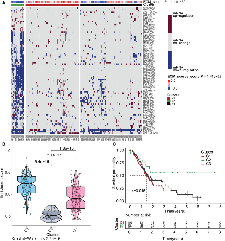
Figure 5.
ECM score-based clustering analysis. (A) Clustering of gene data illustrates 3 clusters displayed by the heat map: ECM active [cluster 1 (C1)], ECM inactive [cluster 2 (C2)], and normal ECM [cluster 3 (C3)]. The proportion of patients with upmodulated genes is shown on the right side of the figure. In the color bar on the right side, red denotes mRNA up-modulation, blue signifies mRNA downmodulation, and white denotes mRNA no-regulation. The ECM score is displayed in four different colors, with negative values shown in blue and positive ones shown in red. (B) The “ggpubr” package’s violin plot indicates that the enrichment scores of the three clusters, from high to low, are C2, C3, and C1. The “kruskal.test” was employed in this study, and the p-values are presented above the clusters. (C) A survival curve depicting the three different clusters. Cluster 2 has a better survival rate compared to either cluster 1 or cluster 3. Cluster 1 is denoted by the red line, cluster 2 is denoted by the green line, and cluster 3 is denoted by the black line. The number of years is signified by the abscissa, while the rate of survival is denoted by the ordinate.

