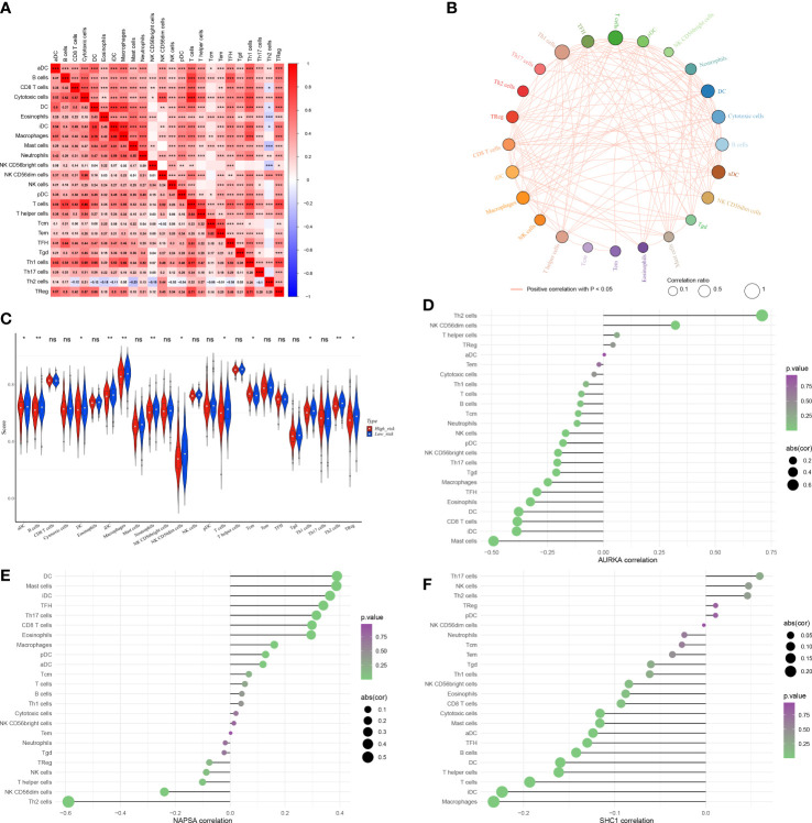
Figure 9.
The immune microenvironment was different between the low and high-risk groups. (A) Heat map of immune cell correlation analysis in the high and low-risk groups. (B) Immunocellular correlation analysis Net plot of the high and low-risk groups. (C) Immune cell infiltration in the high and low-risk groups - Violin diagram. (D–F) AURKA, NAPSA, and SHC1 prognostic biomarker genes, and immune cell correlation. *p < 0.05, **p < 0.01, and ***p < 0.001. "ns" indicates P value ≥ 0.05, not statistically significant.

