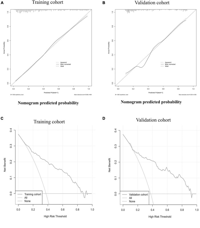
FIGURE 3.
The calibration curve and decision curve of the nomogram in training and validation cohorts. The calibration curves of the nomogram in the training cohort (A) and validation cohort (B) are reported. The x-axis is the nomogram predicted probability and the y-axis is the actual probability. The prediction performance can be measured by the difference of the fitted curve and slope 1 line (diagonal 45-degree line). The diagonal dotted line represents a perfect prediction by an ideal model. The solid line represents the performance of the nomogram, of which a closer fit to the diagonal dotted line represents a better prediction. Decision curve analysis for the nomogram in the training cohort (C) and validation cohort (D) are showed. The y-axis measures the net benefit. The red line represents the nomogram. The blue line represents all patients had MACE. The orange line represents the assumption that no patients had MACE. The decision curve showed that if the threshold probability of a patient uses the nomogram offered a net benefit over the “happen-all” or “happen-none” strategy at a threshold range form 8–88 to 8–92%, respectively in the training cohort and validation cohort.

