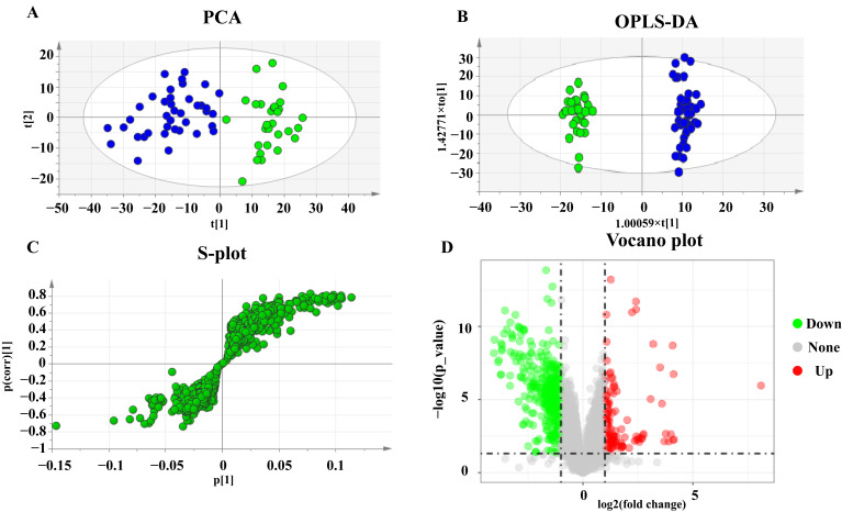
Figure 1.
PCA, OPLS-DA score plots, and S-plots of healthy and UC groups based on HPLC-Q-TOF serum analysis. (A) PCA score plots of healthy and UC group. (B) OPLS-DA score plots of healthy and UC group. Blue represents the healthy group and green represents the UC group. (C) S-plot of healthy and UC group. (D) Volcano plot of healthy and UC group.

