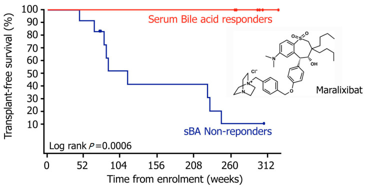
Figure 5.
Median overall survival rate among the PFIC2 patients. This graph shows the median overall transplant-free survival rate among the PFIC2 patients, using Kaplan–Meier curve analysis, for those patients that had a significant sBA decrease, designated as sBA responders (red), compared with those patients that showed an insignificant sBA change, designated as sBA non-responders (blue). The X-axis represents weeks and the Y-axis represents the percentage of patients that were transplant-free.

