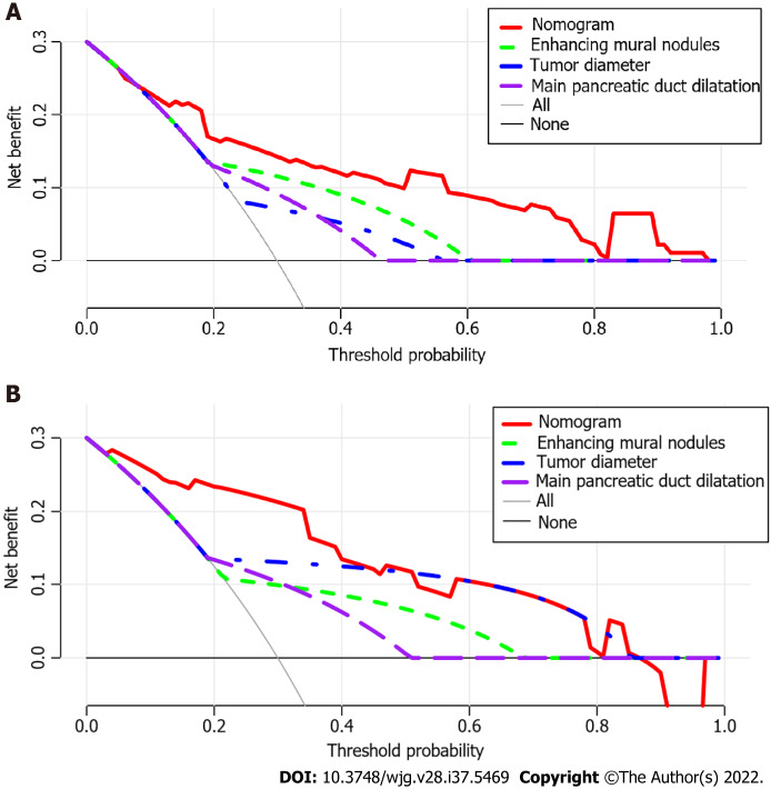
Figure 5.
Decision curve analysis of the nomogram and other three risk factors identified in guidelines. The x-axis represents the threshold probability and the y-axis represents the net benefit. In the training cohort, the nomogram adds more net benefit than the other three factors when the threshold probability ranged from 0.2 to 1.0. In the validation cohort, the nomogram adds more net benefit than the other three factors when the threshold probability ranged from 0.0 to 0.4. A: In the training cohort; B: In the validation cohort.

