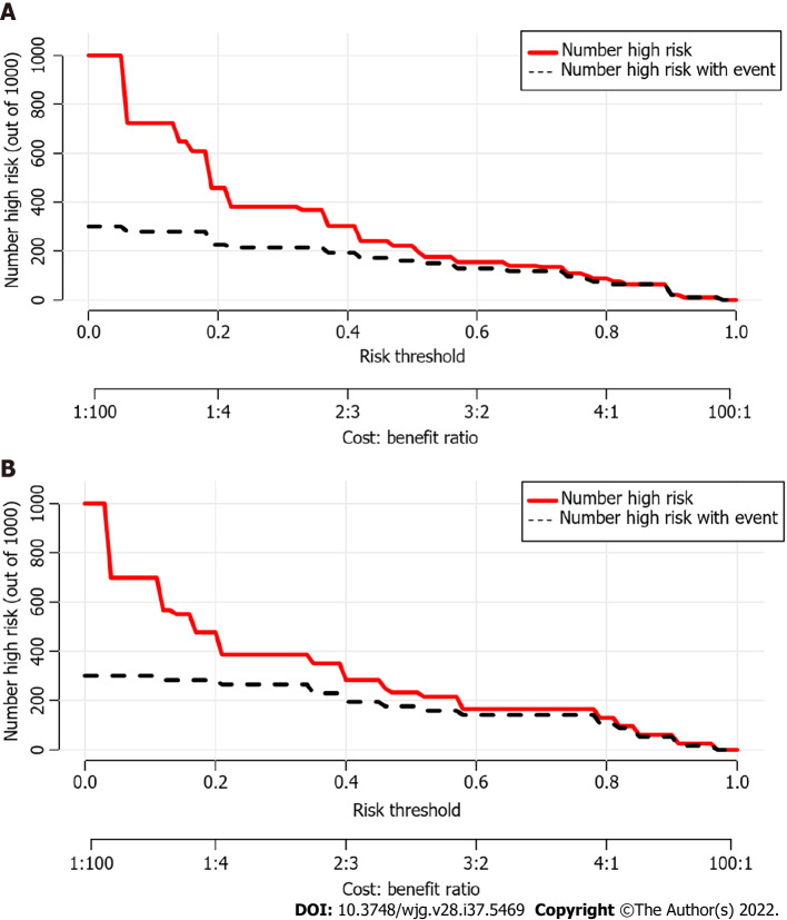
Figure 6.
Clinical impact curves of the nomogram. At different threshold probabilities within a given population, the number of high-risk patients (solid red line) and the number of high-risk patients with the outcome (black dotted line) are shown. In both training and validation cohort, the solid red line and black dotted line show a great fit. A: In the training cohort; B: In the validation cohort.

