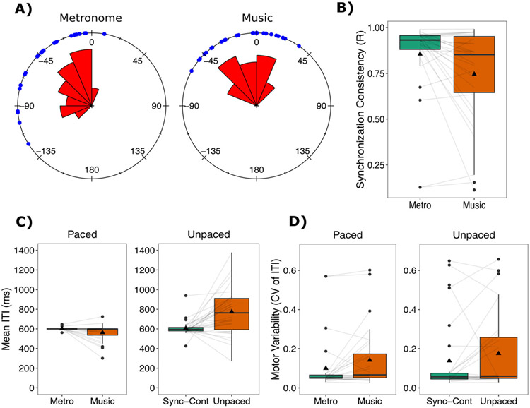
Fig. 2.
Production results. (A) Synchronization accuracy (i.e., angle) and rose plots for paced tapping measures represented with circular statistics. The zero point refers to when the beat occurred. Blue dots reflect individual participant responses. Negative values reflect taps before the beat, and positive reflect taps after the beat. The rose diagram (in red) reflects the frequency of responses in each segment. Sixteens bins were specified, and the radius of each segment reflects the square root of the relative frequency in each bin. See Pewsey et al. (2013) for more details. (B) Synchronization consistency (vector length R) values where 0 = no consistency between taps and 1 = absolute consistency between taps. (C) Mean inter-tap interval (ITI) for the paced and unpaced tapping tasks. For tasks with an external rhythm, all ITIs were 600 ms. (D) Motor variability (coefficient of variation (CV) of the ITI) for paced and unpaced tapping tasks. Boxplots represent the spread of data as implemented in ggplot2 in R. The black line represents the median in each condition, and the black triangle represents the mean. The box represents the interquartile range (quartile 1–quartile 3), and individual dots represent participants who might be considered as outliers in relation to the interquartile range. Individual lines represent individual participants

