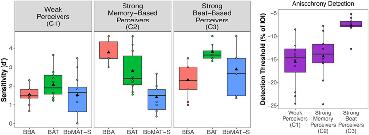
Fig. 4.
The three clusters that emerged from the perception principal component analyses (PCAs) across the four tasks. Note that Anisochrony detection threshold scores (presented as a percentage of the 750 ms inter-onset interval) were reversed in scoring for the analysis and in the figure, such that more negative scores reflect more inaccurate performance. Boxplots represent the distribution of data as implemented in ggplot2 in R, with the black line representing the median. Individual dots represent individual participant data, and the black triangle represents the mean

