
FIGURE 3.
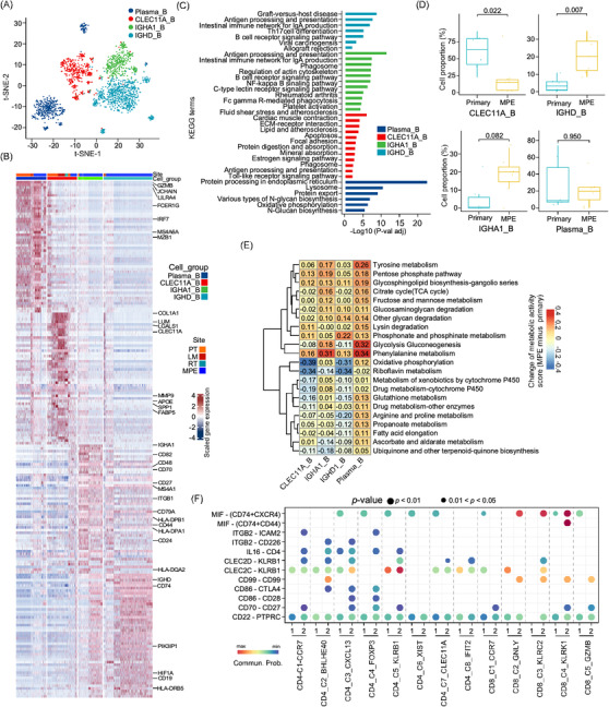
Characterization of B cells in osteosarcoma tumour tissues and MPE. (A) The t‐SNE plot clustered B cells into four sub‐clusters as coloured. (B) The heatmap showed the differentially expressed genes between four B cell sub‐clusters. (C) Bar plot indicated the KEGG enrichment analysis of over‐expressed genes in indicated B cell sub‐clusters. (D) The box plot displayed the proportion of B sub‐clusters in osteosarcoma primary tumour (PT) or MPE samples. A comparison between the groups was performed using the Wilcoxon test. (E) The heatmap presented the differences in metabolic pathway scores in B cell sub‐clusters from MPE and primary tumour tissues (MPE minus PT score). (F) Dotplot exhibited the comparison of ligand–receptor (L‐R) interactions between the IGHA1_B cells and T cell sub‐clusters in MPE and PT. 1 indicated PT and 2 indicated MPE sample.