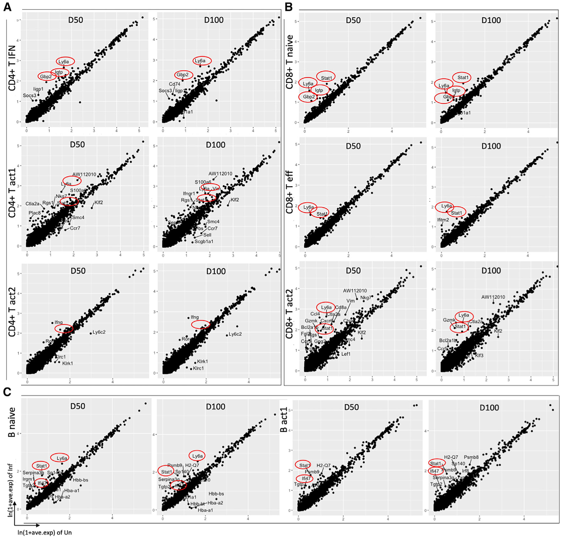
Figure 3. Transcriptional analysis of lymphoid cell clusters.

Scatterplots depicting the comparison of average expression of genes in infected (50/100 dpi) versus uninfected samples in (A) CD4+ T cell clusters (B) CD8+ T cell clusters, and (C) B cell clusters, highlighting the top DEGs (average logFC ≥ |±1|, adjusted p ≤ 0.05). IFN-related genes and Ly6A are highlighted in red circle. Each dot represents a gene.
