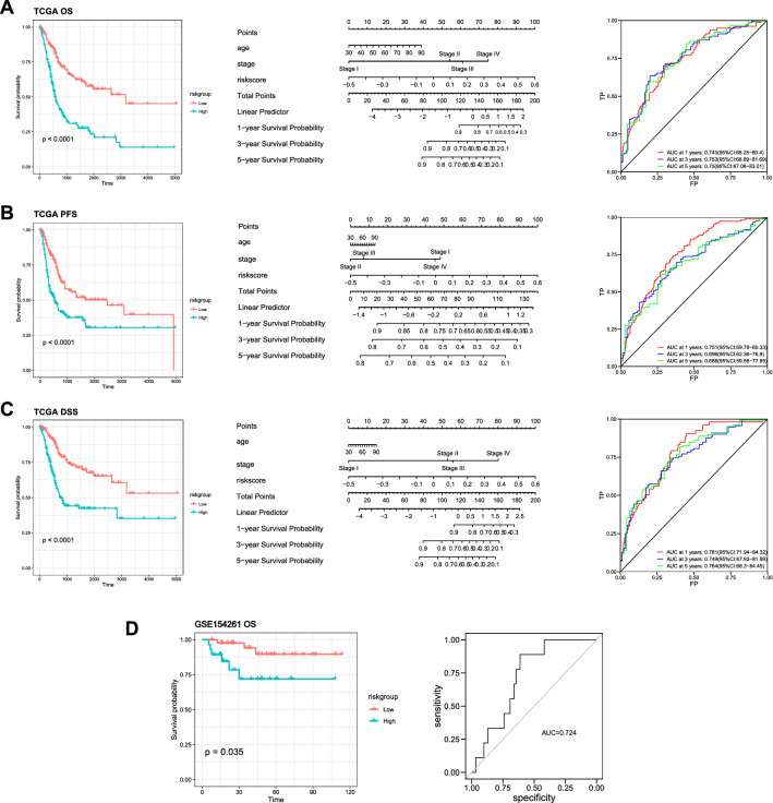
Fig. 3.
Nomogram construction and GEO dataset validation. A–C The left panel shows Kaplan–Meier plots for comparison of low-risk group and high-risk group of overall survival (A), progression-free survival (B) and disease-specific survival (C). The middle panel shows nomograms for comparison of the risk score, and clinical risk characteristics were fabricated to predict the 1-, 3-, and 5-year OS, PFS, and DSS incidences. 1‐, 3‐, and 5‐year ROC curves of the risk score were charted in the right panel to predict OS, PFS, and DSS. D The risk model was validated in independent dataset from GEO, which shows significant predictive value in OS

