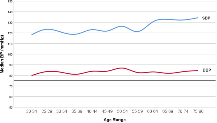
Figure 1.
Graph illustrating the trends of blood pressure readings among different age groups. X-axis represents the different age ranges among our study sample, while the Y-axis represents the median BP reading in each age range. Upper line (Blue) represents the systolic BP trend while the lower line (Red) represents the diastolic BP trend.

