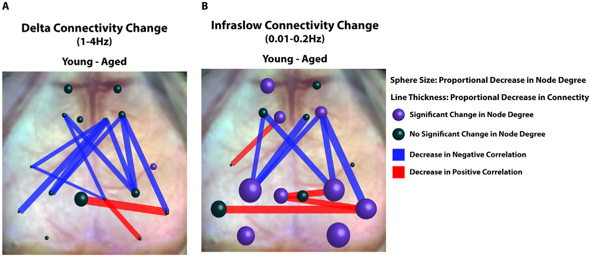
Fig. 7. Summary of Connectivity Changes in Aged vs. Young Animals.

A. Representative diagram of connectivity difference between young and aged animals (young minus aged) within the delta band. Spheres are at locations of seeds used in seed-based FC analysis. Sphere size correlates to the average change in node degree within the seed between young and aged mice (Young - Aged). Average node degree within the seeds was compared between young and aged animals using a student’s T test. Purple spheres represent significant differences in average node degree at that location (p<0.05). Lines between seeds represent significant differences in connectivity (z(R)) between young and aged groups. The thickness of the lines is proportional to magnitude of the correlation difference. Red lines represent age associated decreases in positive correlations and blue lines represent age-associated decreases in negative correlations. B Same as A, but in the infraslow band.
