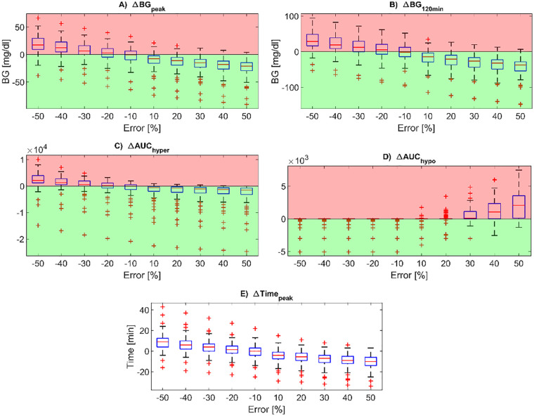
Figure 2.
Boxplots of the difference in post-prandial glucose control metrics compared to the reference case, for all the carb-counting error values tested (on the x-axis). In particular, the BG peak level (panel A), BG level at 120min after the mealtime (panel B), peak time from mealtime (panel E), AUC in hyperglycemia (panel C) and AUC in hypoglycemia (panel D) are reported. Red zones are the ones in which the metrics are worse than for the reference case, while the green zones are the ones in which the metrics are better than for the reference case. In each boxplot, the red horizontal line represents the median, the blue box marks the interquartile range, dashed lines are the whiskers, and red crosses indicate outliers. Whiskers are drawn from the ends of the interquartile range to the adjacent values, which are the most extreme data values that are not outliers. By default, an outlier is a value that is more than 1.5 times the interquartile range away from the top or bottom of the box.

