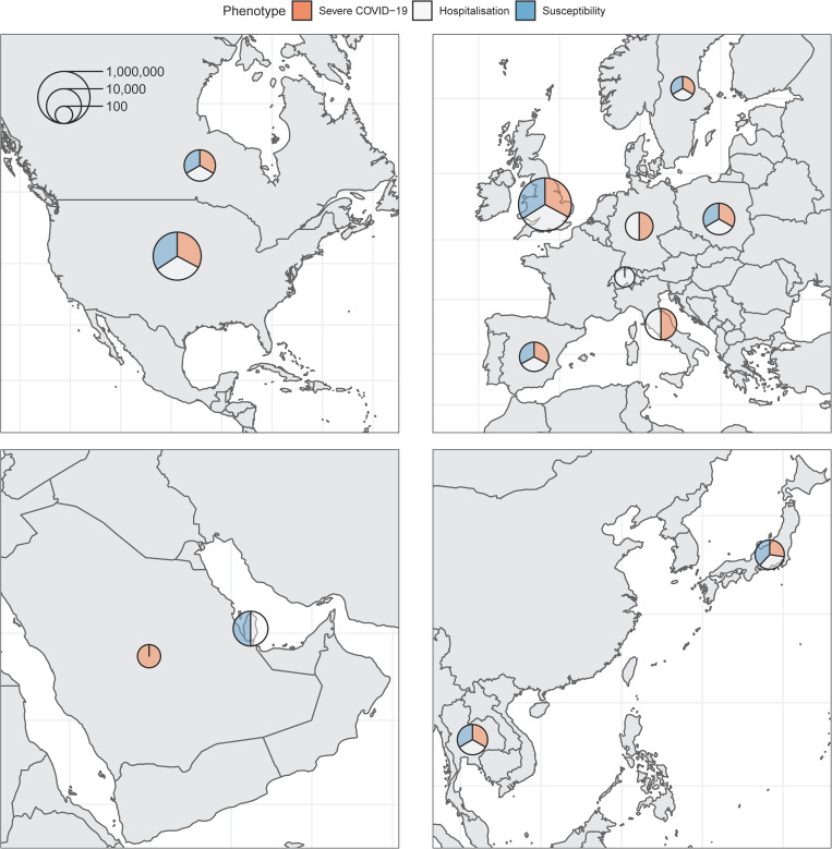
Fig 1. Maps of countries contributing data to the consortium.
Sample sizes (cases and controls) for each phenotype were added and represented on the logarithmic scale by each circle. Relative contribution to each phenotype is represented by the three colors. Maps obtained from https://www.naturalearthdata.com/.

