. 2022 Nov 3;11:e79525. doi: 10.7554/eLife.79525

Figure 3. A CRISPR base editor screen for protein abundance.

(A) Schematic overview of the screen. (B) Network representing all identified gene-protein relationships. In yellow are the eleven proteins and in blue-red are all the gene perturbations that affect at least one of the proteins significantly (FDR<0.05). On the outer circle are gene perturbations that affect only a single protein, whereas on the inside are those that affect two or more proteins. Node sizes correlate with the number of proteins affected. Colors indicate whether a perturbation (predominantly) increases (red) or decreases (blue) the protein(s). The figure was created with Cytoscape (Shannon et al., 2003). (C) For each protein, the number of gene perturbations that cause a significant increase (positive vertical axis) or decrease (negative vertical axis) (FDR<0.05). The darker shade indicates gene perturbations that affect only one or two of the eleven proteins (‘specific’), whereas the lighter shade indicates gene perturbations that affect three or more of the eleven proteins (‘nonspecific’). (D) Same as in (C) but the darker shade indicates perturbations of essential genes, whereas the lighter shade indicates perturbations of nonessential genes. (E) Same as in (C) but the different shades reflect different types of expected mutations introduced by the particular gRNA. (F) Effect sizes (log2 fold changes) of gRNAs that cause a significant change in protein abundance grouped by the type of expected mutation introduced by each gRNA (FDR<0.05).

Figure 3—source data 1. Results of protein abundance screens with 16,452 gRNAs.

Figure 3.

Figure 3—figure supplement 1. Correlation between replicates and among gRNAs targeting the same mutation.

Figure 3—figure supplement 1.

(A) The eight replicates of each protein screen were split into two groups of four and log2 fold changes per gRNA were determined with the same analysis strategy that was used for the overall analysis of eight replicates. All gRNAs that were significant in the overall analysis of the eight replicates are shown. (B and C) Comparison of gRNA pairs that are predicted to target the same mutation into the genome. (B) All gRNA pairs for which at least one gRNA had a significant effect (FDR<0.05) on at least one protein. There are 78 gRNA pairs fulfilling this condition, some of which affect multiple proteins significantly, resulting in 164 data points. (C) All gRNA pairs for which both gRNAs had a significant effect (FDR<0.05) on at least one protein. There are 20 gRNA pairs fulfilling this condition, some of which affect multiple proteins significantly, resulting in 33 data points. Pearson’s correlation coefficients and corresponding p-values are indicated in each plot. The blue line represents the linear regression model with standard error indicated as gray shade.
Figure 3—figure supplement 2. Correlation between the effect of genetic perturbations on mRNA and protein abundances.

Figure 3—figure supplement 2.

The effect of gene perturbations on protein abundances (this study) and on mRNA abundances (Kemmeren et al., 2014) is shown. For this study, the effects of multiple gRNAs were summarized per gene as described in the Methods section. The Kemmeren et al. study used gene deletion strains (Giaever et al., 2002). Each dot in the figure represents the effect of one of 1106 gene perturbations on mRNA and protein abundances of a gene covered in both data sets. Gene perturbations that had a significant effect on both mRNA and protein abundances of a gene in the two studies (q<0.05 and Log2FC>0.5) are indicated as blue dots. For these data points, the regression line, standard error, as well as the Pearson's correlation coefficient and corresponding p-value are shown.
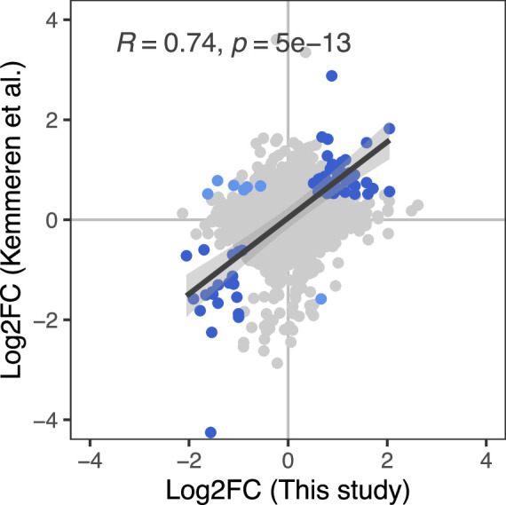
Figure 3—figure supplement 3. Correlation between the number of gene perturbations significantly affecting a protein and the absolute abundance of that protein.

Figure 3—figure supplement 3.

The number of gene perturbations with significant effect (FDR<0.05) is not dependent on the absolute abundance of the protein. Absolute protein abundances were obtained from (A) Newman and colleagues (Newman et al., 2006) and (B) Ho and colleagues (Ho et al., 2018). Pearson's correlation coefficients and corresponding p-values are indicated. The blue line represents the linear regression model with standard error indicated as gray shade.
Figure 3—figure supplement 4. Correlation between number and effect size of perturbations with significant effects and their target site across the gene.

Figure 3—figure supplement 4.

Perturbations toward the end of a gene tend to have fewer and lower effects. (A) Ratio of gRNAs with significant effect vs all gRNAs as a function of target gene position. (B) Absolute effect size of gRNAs with significant effect as a function of target gene position. The blue line shows a local polynomial regression fit (loess) with gray shades indicating the standard error. The plot was generated using the geom_smooth(method = 'loess') function from ggplot2 R package with default parameters.