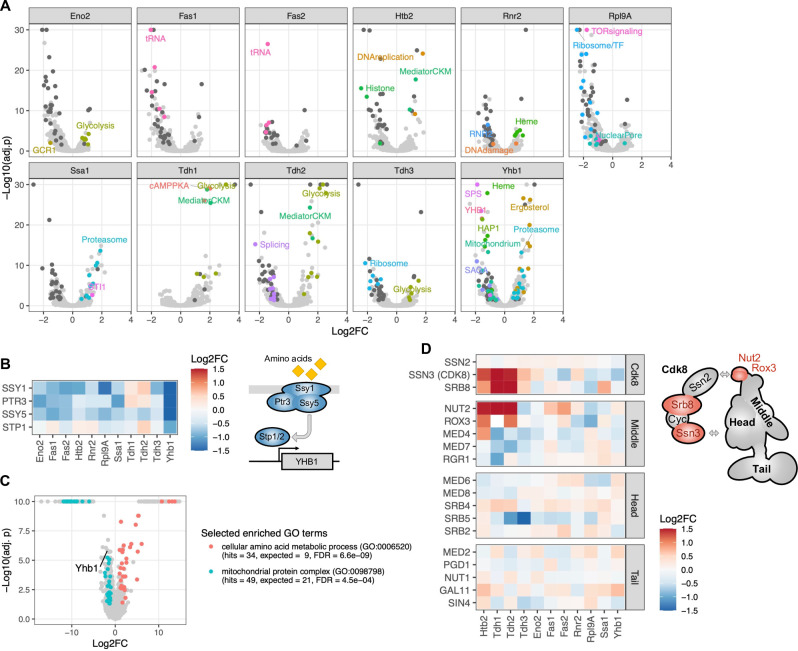
Figure 4. Regulators of protein abundance.
(A) Each volcano plot contains the results for a single protein, with each dot representing the effect of a gene’s perturbation on that protein. The vertical axis represents the negative logarithm of the FDR-corrected p-value. Selected dots are colored to highlight functional classes. Dark gray dots indicate genes that significantly affect eight or more proteins (FDR<0.05). (B) Heatmap showing effects of gene perturbations in the SPS amino acid sensor on the eleven proteins. In the scheme, all subunits with significant effect on Yhb1 are colored (FDR<0.05). (C) Volcano plot showing abundance changes of proteins in the SSY5 G638Q mutant compared to wild type as measured by LC-MS proteomics. The vertical axis represents the negative logarithm of the FDR-corrected p-value. Selected enriched functional categories (gene ontology (GO) terms) are colored. (D) Heatmap showing effects of gene perturbations in Mediator on the eleven proteins. In the scheme, all subunits with significant effects on Htb2 are colored (FDR<0.05); arrows indicate suggested interaction points between the Cdk8 module and mediator (Tsai et al., 2014; Tsai et al., 2013). The color scale for the heatmaps is capped at –1.5 and 1.5.

