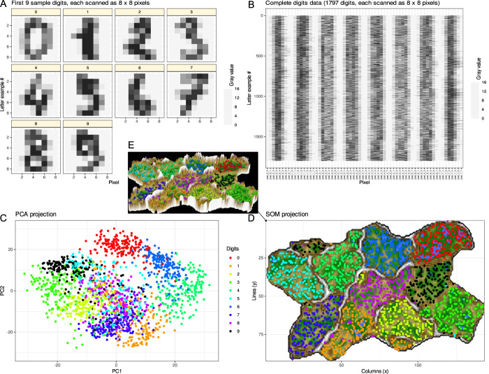
Figure 4.
Example of data structure detection after a data projection as a frequent first step. A generic data set was used containing 8 × 8 pixel scans of handwritten digits 0, …, 9 from the data set collection of the Python package “scikit-learn” (https://scikit-learn.org/stable/).71 The pixels were numerically converted to gray values. (A) First 10 digits in the data set given as an example. (B) Matrix plot of the complete data set of scanned handwritten digits from 1,797 individuals. The 64 pixels of which each digit is comprised are arranged in rows of 64 numerical gray-values. The complete data set has little meaningful structure among the gray values, analogous to many biomedical data sets, including pain-related data, where measurements from patients are included instead of gray values but an immediate subgroup structure cannot be seen. The task in detecting a data structure is to identify classes/subgroups/clusters in the data set, such as identifying in this example that the data set in panel B contains gray values of 10 classes of handwritten digits. (C) Principal component analysis (PCA)-based projection of the data set onto a 2-dimensional plane using principal component (PC) 2 vs PC1. The dot plot is color coded for the classes, ie, the different digits. On the PCA projection, the 9 different digits are partially separable, such as “0” (red) forming a separate cluster at the top, suggesting that the projection enhances the detection of a class structure in the data set that was obscured in panel B. However, without knowing the ground truth as in the present example, it would be difficult to see that the data set contains 9 different classes. (D) Alternative data projection using machine learning in the form of a self-organizing map of artificial neurons. The panel shows results of projection of data onto an emergent self-organizing map (ESOM85,90) neurons, providing a 3-dimensional U-matrix visualization of distance-based structures of the gray values after projection of the data points onto a toroid grid of 9,000 neurons where opposite edges are connected using a Gauss-formed neighborhood function and 25 training epochs for the SOM. The dots represent the so-called “best-matching units” (BMUs), ie, neurons on the grid that after ESOM learning carried a data vector that was most similar to a data vector of a sample in the data set. The U-matrix visualization was colored as a top view of a topographic map with brown (up to snow-covered) heights and green valleys with blue lakes. Watersheds indicate borderlines between 2 different clusters separated by the white “mountain ridge” at the left of the U-matrix. (E) Separation between the classes is better visible in a 3D presentation of the U-matrix in panel D. The ESOM projection detected most of the classes separately; however, the separation was also not perfect and with “9” seems to be split into 2 classes, which might hint at indeed to main versions of writing “9”. In this example, this was not further analyzed, but in biomedical data, this might lead to the discovery of a so far unknown subgroup. The figure has been created using the software package R (version 4.2.1 for Linux; https://CRAN.R-project.org/)73 and the library “ggplot2” (https://cran.r-project.org/package=ggplot2)93 and our library “Umatrix” (https://cran.r-project.org/package=Umatrix).53

