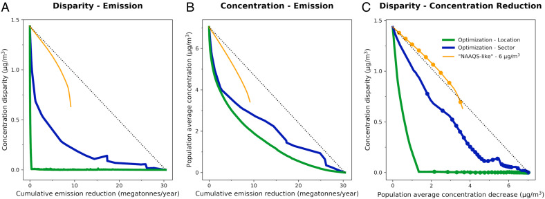
Fig. 1.
exposure-disparity and concentration-reduction curves. (A) Concentration disparity between the most exposed racial-ethnic group (Asian, Black, Hispanic, White, or Other) and the population average (y axis) versus cumulative emission reduction (x axis). (B) Population average concentration versus cumulative emission reduction. (C) Concentration disparity versus population averaged concentration (i.e., the y axis values from A and B). For each panel, current conditions are the left side (i.e., “do nothing” at x = 0), and a complete (100%) emission reduction is the right side (i.e., achieving zero emissions: lower right, at x = 30.4 MT/y in A and B, at x 7.0 µg/m3 in C). Each panel compares three approaches to emission reduction: location (green line), sector (blue line), and NAAQS-like (i.e., employing a concentration standard; here, 6 µ; orange line). An “equal reduction” approach, where all emissions are reduced proportionately, would be a straight line (black dotted line). The location approach (green line) can eliminate national disparities with modest total emission reductions, whereas with the other two approaches, national disparities remain, even after substantial emission reductions (A and C). The location approach also does as well as or better than the other two approaches, for population average concentration (B and C).

