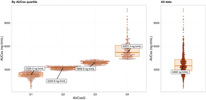
Fig. 1.
Distributions of the simulated ipatasertib AUCSS in the IPATential150 study population by AUCSS quartile (left panel) or as overall (right panel). Filled circles represent the simulated exposure of individual patients. Annotations represent medians in each group. Solid bold lines, shaded boxes, and whiskers in the box plots represent the medians, interquartile ranges, and 1.5 times the interquartile range, respectively. AUCSS area under the concentration–time curve at steady state, AUCSSQ AUCSS Quartiles

