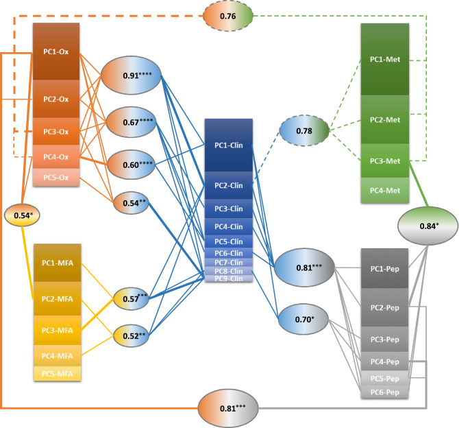
Figure 4.
Graphical representation of the canonical correlation analysis. Each oval box represents a significant correlation (r) between linear combinations of PCs from two data set, with lines indicating the PCs from each data set significantly contributing to the combination. Thick lines indicate prominent contributions, i.e. the PC with a coefficient at least 1.5 times greater in modulus than that of any other PC in the same combination. PC box size is proportional to the variance explained by that PC within the dataset. ****p < 0.0001; ***0.0001 ≤ p < 0.001; **0.001 ≤ p < 0.01; *0.01 ≤ p < 0.05. Dashed lines indicate not statistically significant (0.05 < p < 0.15) though very strong (r > 0.7) correlations.

