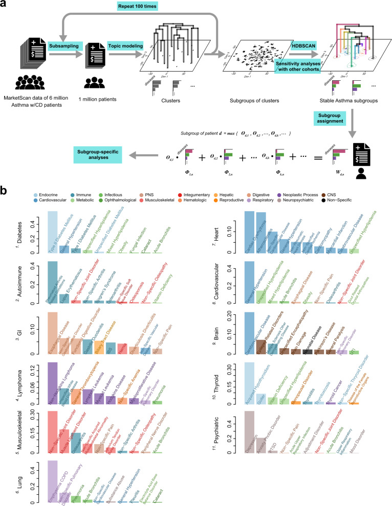
Fig. 1. Identification of asthma subgroups through topic modeling.
a Flowchart of asthma subgroup identification. The MarketScan data includes around six million asthma patients who have at least one comorbid disease (CD). To enable the estimation of sample statistics, we randomly selected one million patients and applied topic modeling to obtain comorbidity clusters (one cluster is projected as one point in the t-SNE plot). This procedure was repeated 100 times, generating a large collection of clusters shown as thousands of scattered points in the t-SNE projection. We used this t-SNE low-dimensional projection of topics only for visualization purpose, rather than for cluster discovery. With inter-cluster dissimilarity measured by Jensen-Shannon divergence, we applied HDBSCAN to identify stable subgroups of clusters as well as their hierarchies. A potential subgroup was deemed to be a stable “asthma subgroup”, only if it harbored more than 50 cluster points. We also conducted a sensitivity analysis on our identification approach in four additional cohorts, and subsequentially show the eleven subgroups that were commonly found in all the different cohorts above. Then, given the distribution of diagnosis counts shown in an individual’s record, we can express it as a linear combination of the distributions of diagnosis counts as defined in the asthma subgroups, and suggest that the subgroup with the largest assigned coefficient could represent the individual’s record best, therefore “assigning” the individual to this subgroup (, , and contain the information about record-diagnosis co-occurrences, subgroup profiles, and assignment coefficients, respectively; see Methods for more details). b The top ten frequently occurring diseases in the identified eleven asthma subgroups. A complete and precise definition of an asthma subgroup requires one to specify the frequency distribution of 567 disease groups. For each subgroup, we use a bar plot to show its top ten frequently occurring diseases, and color-code the bars as well as the annotations by the broader categories that the diseases belong to. The y axis denotes the normalized occurring frequency of a given disease, and we can see that a subgroup is named after the broader category to which several most frequently occurring diseases belong (see Supplementary Data 1 for the subgroup profiles in detail).

