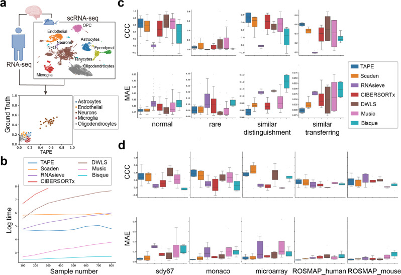
Fig. 2. Comparison of deconvolution algorithms on benchmark datasets.
a Deconvolution procedure diagram. Bulk RNA-seq data and single-cell data should come from a homologous tissue. b Time complexity analysis of different methods (including pre-processing steps). Time measured by seconds is scaled by to show the differences more clearly. These tests are conducted on the simulated data. The time limit is set to 2500 s. Any longer test was not conducted. c Deconvolution results on simulated data. CCC represents the Lin’s concordance correlation coefficient, measuring the concordance between the predicted fraction and the ground truth. MAE represents mean absolute error, measuring the accuracy of prediction. Higher CCC and lower MAE are better. Each box contains metric values for all the cell types considered in all the tissues. Different color refers to different methods. Sample size in the four scenarios from left to right is 44, 12, 4, and 4, respectively. Sample size of different method is the same. d Deconvolution results on real data. The columns’ labels refer to the datasets. CCC and MAE are used as metrics. Sample size of each method on each dataset consistently equals to 5. In c, d, the boxes represent interquartile range (IQR) while the solid line represents the median. The whiskers extend to points that lie within 1.5 IQRs of the lower and upper quartile, and then observations that fall outside this range are displayed as points independently. Source data are provided as a Source Data file.

