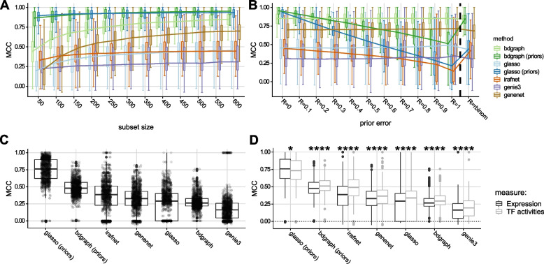
Fig. 2.
Method comparison results. A Results of simulation study: y-axis shows the Matthews correlation coefficient (MCC) as compared to the simulated ground truth; x-axis indicates increasing sample size from left to right; colors indicate different inference methods. B Similar to A, but x-axis indicates increasing errors in the prior matrix from left to right for N = 612 samples. Group (‘rbinom’) indicates uniform prior set to reflect degree distribution of true graph. C MCC (y-axis) between networks inferred on KORA and LOLIPOP data for same locus for all methods (x-axis). D contrasts MCC across cohorts using TF expression (dark gray) versus using substituted TFAs (light gray). Boxplots show medians (horizontal line) and first and third quartiles (lower/upper box borders). Whiskers show (inter-quartile range); for B, dots depict individual results, and for C, stars indicate significant difference between expression/TFA results for each method (Wilcoxon test, *: , **: , ***: , ****: )

