. 2022 Nov 8;11:e81114. doi: 10.7554/eLife.81114

Figure 1. Flowchart of the interaction-perturbation-based program.

As an example, the background network consists of six genes and five interactions. There were three normal samples (yellow) and three cancer samples (pink). A rank matrix was obtained by ranking the genes according to the expression value of each sample. The rank matrix was converted to a delta rank matrix with five rows and six columns representing interactions and samples, respectively. The benchmark delta rank vector was calculated as the delta rank of the average expression value in all normal samples. The interaction-perturbation matrix was obtained by subtracting the benchmark delta rank vector from the delta rank matrix.

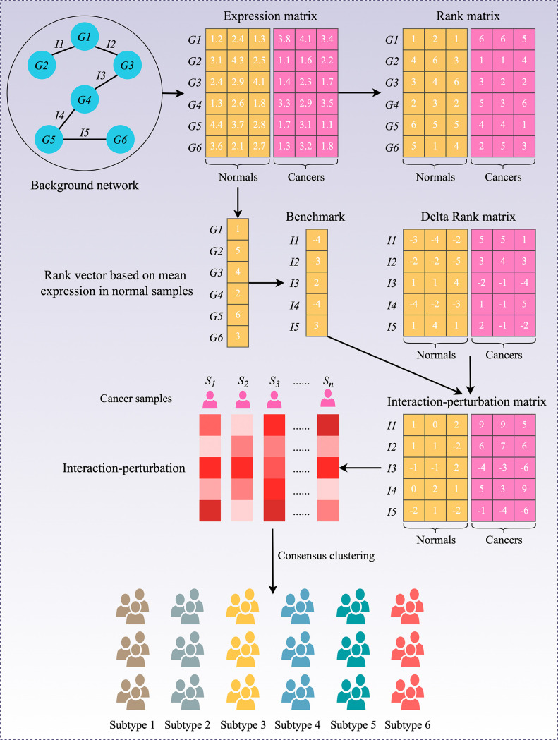
Figure 1.

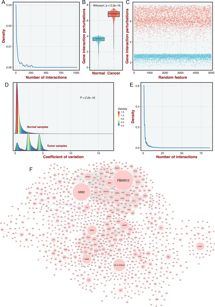
Figure 1—figure supplement 1. Construction of the gene interaction-perturbation network.

Figure 1—figure supplement 1.

(A) As the number of interactions increased, the density decreased significantly, presenting a power distribution in the background networks. R was computed as the Pearson correlation between log10 (interaction number) and log10 (corresponding frequency), which was used to measure the fitting level of the power law curve. The better the curve fitting level is, the closer R is to 1. (B) The distribution of gene interaction perturbations between normal and tumor samples. (C) The scatterplot for the log2-transformed mean of the interaction perturbations in the 5,000 randomly selected edges in both normal (blue points) and CRC (red points) tissues. The interaction perturbations of normal samples were much denser and less than tumor samples. (D) 92.6% of all 148,942 gene pairs exhibited more dispersion in tumor samples than in normal samples by comparing the coefficient of variation (CV) of interaction perturbations. (E–F) This new network with 1,390 genes and 2,225 interactions also met the scale-free distribution (E) and was visualized (F), the node size represents connectivity.