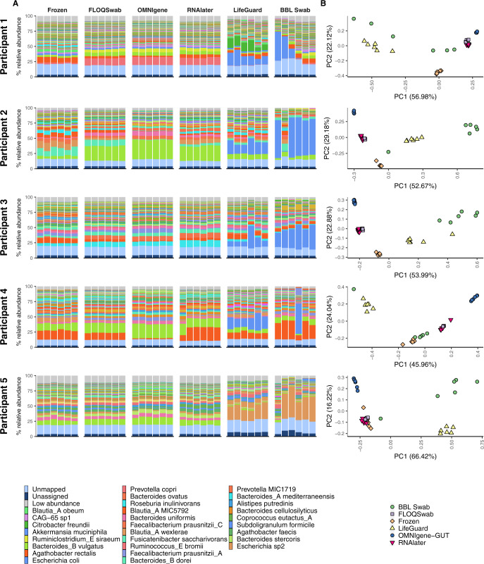
Fig. 4. Comparison of species profiles for each replicate from the five participants (Fig. 1).
Profiles are organised by participant and stabilisation method. A Bar chart of microbial species with the highest mean abundance for each participant. The light and dark blue bars at the bottom of each bar plot indicate the percentage of unmapped and unassigned reads, respectively. The light grey bar at the top of each bar plot indicates the proportion of species with a minimum abundance <0.5% across all samples from a participant. B Principal component analysis plots of Hellinger transformed species profiles are provided for each participant with each stabilisation method depicted by a different colour and shape combination.

