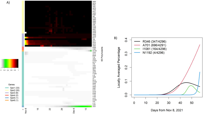
Figure 3.
Temporal analysis of polymutants in spike protein: (A) a heatmap representation of dynamic expansions/subtractions of 65 polymutants, in which locally averaged mutation percentages of every polymutant over time are shown in a row and is correspondingly colored from gray to dark red (color legend on the left side). By similarities/dissimilarities of their temporal patterns, all polymutants are clustered to six clusters (Spk1, …, Spk6), and numbers of polymutants in each cluster are indicated in bracket. (B) Four polymutants with positive trajectories (in cluster Spk4, 5 and 6) are selected to illustrate their temporal patterns. Heatmaps and temporal plot are generated by heatmap package and plot function in statistical R software3.

