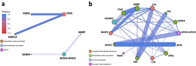
Figure 4.
Network analysis. Network plots illustrating protein–protein interactions in (a) EOPE versus healthy pregnancy and (b) LOPE versus healthy pregnancy. Each node represents one protein; and each edge represents a pairwise Pearson correlation between proteins. The networks only show Pearson correlation coefficient > 0.7 or < − 0.7. Node: colour coded according to the functional classification of proteins annotated by DAVID database; size proportional to the corresponding eigenvector centrality (network influence). Edge: colour and length proportional to the Pearson correlation coefficient; width proportional to the scores derived from STRING database.
Source data are provided as a Source Data file.

